
In this blog we will be talking about Bootstrap 4, let’s start from the beginning. Bootstrap is a CSS Framework which facilitates the development of web design, which is adaptable to any device. That is why the powerful Framework is one of the most popular and accessible of our time. Now that we know what Bootstrap is let’s continue with our central theme.
Lately, there has been a lot of talk about the new version of Bootstrap; and somehow, web developers have used Bootstrap or at least know what are the most used classes.
You should know that there is still support to continue using Bootstrap 3, but due to some changes that arose in the structure of Bootstrap 4 over its previous version, it is better to start developing or migrating our applications to this incredible new version. These changes support the design with greater stability for new resolutions through which our web applications can be viewed.
Let’s get to know Bootstrap 4
Bootstrap 4 began to develop under four technologies of high consumption and importance which are: HTML 5, CSS3, JavaScript, and Sass. This last technology is one of the leading changes, although it was already created in Bootstrap 3 through a port, now it is used in a predefined way with the help of the Libsass library. And it is for these same technologies that we recommend migrating from Bootstrap 4 to Bootstrap 3. We will give you more information about the changes that occurred between these two versions so that you can decide between them.
How can you make a migration?
To make a migration, you must know the differences that exist between each one of the versions since you must rename some classes and create some configurations. Let’s start to know some of the main changes that exist between versions.
Let’s be concrete
It is time to go into detail to see the ten most important changes of Bootstrap 4 against Bootstrap 3.
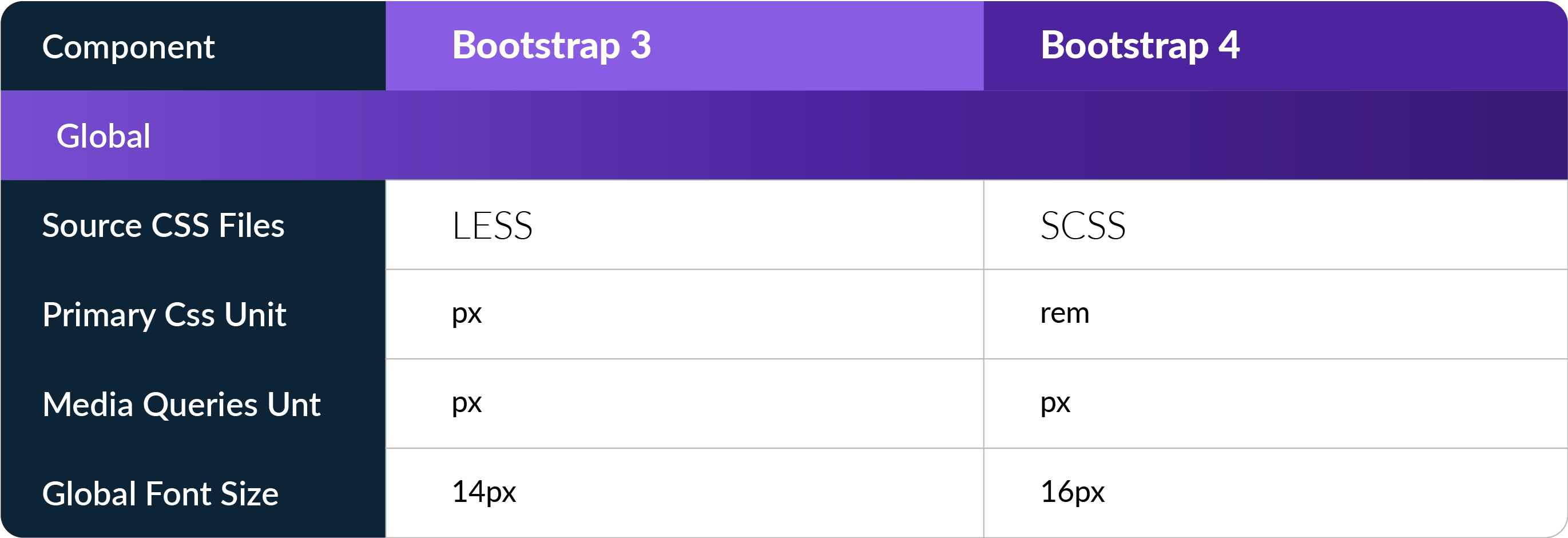
1. From LESS to SASS
Because it is easier to use and compiles more quickly since it offers many more possibilities for development.
2. Support for Flexbox
This new option allows the use of div with automatic height, which will enable it to be adaptable. Previously, you could make the changes on your own, but Bootstrap decided to add them by default. Unfortunately, it is not yet supported by IE9 (Internet Explorer 9) or less, that is why the Flex option is disabled, but it can be enabled by opening the files _variables.css and enable flex: $ enable-flex: true! default; .
3. New classes
In the version of Bootstrap 3 it was necessary to create several custom classes to be able to design your website, but now Bootstrap 4 has excellent news for you. Now you can create specific classes, for example, improved classes to align texts and classes to add a margin or padding with variable values are a great advantage.
The syntax is simple:
Classes are named using the format {property} {address} – {size} for xs and {property} {address} – {breakpoint} – {size} for sm, md, lg and xl.
Also, new custom styles were added to the buttons, among many other things. Now thanks to Bootstrap 4, you can be sure that your custom CSS files will be smaller.
4. A new size of Grid Layout
There are now five grid levels to support typical portrait and landscape screen widths. Bootstrap 4 introduces a new grid with the classes col-xl- *. This additional level extends the average query range to 544 px. Although the new XL level would suggest that it has been added to support extra large screens, it is the opposite.
All 3.x levels slide up in 4.x, to fit in the new level from 544 px to 768 px in the bottom. While the old 3.x col-xs- * supports screen widths less than 768 px, the new level 4.x col-xs- * supports screen width below 544 px. The new xs level is smaller, meaning enhanced support for smartphones.
5. A new unit of measure for typography (rems)
Now Bootstrap 4 allows us to streamline the responsive design of our texts; this is because uses rems instead of px, this makes it easier to change the values in media queries, since now it would only be necessary to change the value that has in the HTML tag instead of changing each class.
6. Goodbye glyphicons
In many occasions, they were an extra element that not many people wanted to use, and developers prefer to use other resources so Bootstrap decided to eliminate the glyphicons betting on the icon library of Font Awesome, this caused a change in the Bootstrap structure since now the fonts folder does not exist.
7. ECMAScript 6 is incorporated
Now EC6 is in Bootstrap, developers were given the task of rewriting all JS files to take advantage of each of the improvements that EC6 offers.
8. New components and changes in many of them
It is worth mentioning that many changes were made in several classes used in Bootstrap 3, perhaps the most important new component is the cards since this will handle new and different styles, layers and designs to create panels. There are many more changes which I invite you to review in depth when entering this link this link review them all.
9. Restart
In the version of Bootstrap 3, we used Normilize.css to change the order of all the HTML elements to have a consistent appearance. Now Bootstrap 4 adopted an improved version of Normilize.css, that means, an optimal reboot.
10. Bootstrap 4 is lighter
Despite having more classes, Bootstrap 4 is lighter than its predecessor; this is due to the use of Sass and the loss of the Fonts folder. This allows to have lighter projects and increase the speed of our website loading time.
After seeing these new features, you already know the fundamental changes that you must make to your web page to be able to migrate from Bootstrap 3 to Bootstrap 4. But this is only the surface of all the changes that Bootstrap 4 presents, you can check more information on the official Bootstrap guide.
In summary, Bootstrap 4 offers a lot of significant changes on their framework to design a web page, making it easier to create new designs with more freedom than ever. Do not forget to review the documentation that they offer so you can get them out the maximum benefit to Bootstrap 4.
We are already familiar with this new version of this powerful CSS Framework. Using this framework brought user interaction improvements and flawless responsive designs so that anyone can enjoy websites on any device.


